Thursday 25 April 2013

Development 4

Before:
This is how I started my contents page, however I felt that it would not be suitable to use because the background is too bright and it would make the text hard to read. Also I felt it was too basic as it just has "features" and some text, no other images.


After:
This my new contents page, I felt that this is a better copy as, the page is full. Also I had the "features" AND "regulars" so it is mixed and not just basic. Furthemore, I have two more images which relates to the magazine and the genre itself

Development 3

This is my finished front cover, I added the typical conventions, such as coverlines, masthead, dates and issue number and of course a cover image.

Development 2

Before:
I felt at first this would have been good for my cover as it follows the basic convention of any magazine, however I felt it had dead space around it and I thought it would be better to be different and play around with what I could do using photoshop.


After:
Having duplicated the image I felt that it filled  that space. Additionally with that I felt it symbolized something as it is done in a triangle shape as the the centered image is at the top whilst the images to the left and to the right are lower. This would straightaway catch the attention of the target audience.

Development 1

This is the background I am going to use, what I done here was take an image of a brick wall and then I applied at focal point and bokeh lights on the background, the reason being is that whatever cover photo I add, it will be stand out.

Beginning of Magazine

This is the start of my magazine, I started creating the front cover using photoshop cs6. I felt the text used is suited as it is American retro old school rap. The reason for duplicating him is because it shows that he is center of attention. Additionally the effects I put on the image is there to show the importance of the image, as there is a focal zoom on the wall which straight away puts some attention on the three duplications.


Reason for photography


I put this image in my magazine for the reason that it follows the convention of "hip-hop/rap" magazine. For instance the pose he's making is the same pose of a famous rapper in the music industry. Additionally what he is wearing correspondes with the the genre hip-hop, as the label "supreme" is big in the hip hop industry because people wear it a lot.

Reason for Photography

I am using this image because it represents the "hip-hop" genre, as the hat the male is wearing is the hat of a rapper that is really big in the music industry. Furthermore, the way both of them are posed is the stereotypical of posing as the "leg on the wall" pose has been done for years. Another reason why this is a good image for my magazine is because of the background. It follows the urban look in which rappers do their music video's.  

Monday 4 March 2013

Music Media Analysis


MAIN TASK

My Main Task is to create a music magazine.
The genre I have chosen is Hip-Hop/Rap

Deadline Dates;
 Research: 4th March
Drafting & Development/Photography: 18th March
Production (initial Submission): 15th April
Production (final submission): 19th April
Evaluation: 26th April

Evaluation

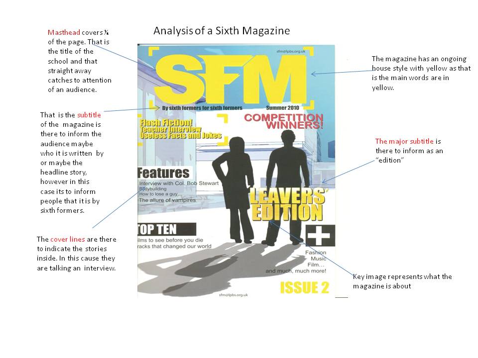
My magazine follows the basic conventions of a magazine. As it has a masthead, cover lines and images. My magazine represents the social group of sixth formers (teenagers) as all the images have got to do with sixth formers. Also the text I conclude underlines what is going on in my magazine which will attract the target audience to reading it.

A college/sixth form would be the perfect institution for my magazine and the reason being is because the target audience would be able to relate to what is in the magazine, for example, one of the cover lines talk about "exams". A student would be interested into that straight away because sixth formers and college students would need help in that.

The way I attracted the target audience was by including the front cover of an image of two girls with art that attracts the audience because people see good pieces of work and that would interest them and would want to read the magazine. Although the text is formal, the audience have the ability to understand what is being said as the words used are still simple.

What I have learned through the process of making is that I should use other media software’s, such as “Photoshop” as well as “Indesign”. The reason for that is because my magazine would be more creative and inventive.

Thursday 10 January 2013

The Target Audience

The magazine idea I have is for my school Trinity as you can see from some of the images I have uploaded. I will base it on the sixth form, as I am able to relate as well as that it is more convenient. That is also what my audience will be, the age range of 16-19, in doing so I will include things that the age group would relate to for example images of a group of boys or girls, to show unity and friendship which is what people want. I will also include in the contents page things like "how to breeze through your exam". Things like this will automatically attract my audience.

This post shows the research I have done with regards to a magazine cover and contents.